Difference between revisions of "CombatHUD"
m (Minor tidy-up.) |
(Now done by template.) |
||
| (4 intermediate revisions by one other user not shown) | |||
| Line 1: | Line 1: | ||
| − | '''Combat HUD''' |
||
| − | |||
==Overview== |
==Overview== |
||
| − | The Combat HUD is a neatly laid out HUD, with information grouped logically around the main scanner. Comms and Console messages appear above |
+ | The Combat HUD is a neatly laid out, fully featured HUD, with information grouped logically around the main scanner. Comms and Console messages appear above or next to the dials. Combat HUD switches to 'Combat Mode' when at Red Alert - vital information is presented around the crosshairs. |
The Combat HUD will comfortably acommodate up to Eight energy banks and Sixteen pylons, making it suitable for all available ships. |
The Combat HUD will comfortably acommodate up to Eight energy banks and Sixteen pylons, making it suitable for all available ships. |
||
| − | '''Standard HUD - top image:-''' |
||
| + | The 'Weapons Offline' indicator is below the crosshairs (and Aft Shield dial when at Red Alert). |
||
| + | There are two Multi-function Displays, in the top left and right corners. |
||
| + | |||
| + | Code for Non-linear scanner, and Scanner Ultra-zoom is included but commented out. To activate these functions you should open the hud.plist in the Config folder, and remove the comment marks (//). This can be found at the bottom of the plist. |
||
| + | |||
| + | ==CombatHUD== |
||
| + | |||
| + | '''CombatHUD''' |
||
On the left side of the main scanner are the speed, pitch and roll, fuel, cabin temperature and altimeter gauges. The Compass and Scanner Zoom are also here, and Comms messages will be displayed above these gauges. |
On the left side of the main scanner are the speed, pitch and roll, fuel, cabin temperature and altimeter gauges. The Compass and Scanner Zoom are also here, and Comms messages will be displayed above these gauges. |
||
| − | Laser temperature, shields and Energy have been grouped together on the right side. The Console messages are also on the right side, above the gauges, and the scoop indicator, status light and joystick sensitivity indicator also appear here. The Aegis indicator is bottom-right. |
+ | Laser temperature, shields and Energy have been grouped together on the right side. The Console messages are also on the right side, above the gauges, and the scoop indicator, status light and joystick sensitivity indicator also appear here. The Aegis indicator is bottom-right, and primed equipment is displayed to the left of this. |
The Clock is centred at the top of the HUD, allowing room for up to the maximum of 16 pylons at the bottom. |
The Clock is centred at the top of the HUD, allowing room for up to the maximum of 16 pylons at the bottom. |
||
| − | '''Red Alert HUD - lower image:-''' |
||
| + | |||
| + | [[Image:Ch-std.png|center]] |
||
| + | |||
| + | '''CombatHUD at Red Alert''' |
||
The Combat HUD has been optimised for combat situations. If a scanner targeting enhancement is fitted the reticule will turn red when the target is centered. |
The Combat HUD has been optimised for combat situations. If a scanner targeting enhancement is fitted the reticule will turn red when the target is centered. |
||
| Line 18: | Line 26: | ||
These dials are removed and replaced by the standard position dials when no longer at Red Alert. |
These dials are removed and replaced by the standard position dials when no longer at Red Alert. |
||
| − | [[Image: |
+ | [[Image:chRedAlert.png|center]] |
| + | |||
| + | ==Widescreen version== |
||
| + | |||
| + | There is also a widescreen version for 16:9 and 16:10 monitors. This version moves the Comms and Console messages, and the MFDs to the top and bottom corners to keep the centre of the screen clear. |
||
| + | |||
| + | '''CombatHUD Widescreen''' |
||
| + | |||
| + | [[Image:Chws2.png|center]] |
||
<br> |
<br> |
||
| Line 42: | Line 50: | ||
==Version History== |
==Version History== |
||
| + | |||
| + | v4.1 Released 6th July, 2014. graphical improvement to the Red Alert dials. |
||
| + | |||
| + | v4.0 Released 5th July, 2014. Major overhaul to add features. Widescreen version added. |
||
v3.0 Released 29th June, 2014. OXZ only. Adds MFDs and 'Red Alert' functions to original design. |
v3.0 Released 29th June, 2014. OXZ only. Adds MFDs and 'Red Alert' functions to original design. |
||
| Line 55: | Line 67: | ||
Download CombatHUD_v2.1 OXP [http://www.smivsonline.co.uk/oxps_combathud.htm here] |
Download CombatHUD_v2.1 OXP [http://www.smivsonline.co.uk/oxps_combathud.htm here] |
||
| − | Download [[Media: |
+ | Download [[Media:CombatHUD_v4.1.oxz|Combat HUD v4.1 OXZ]] (downloaded {{#downloads:CombatHUD_v4.1.oxz}} times). |
| + | |||
| + | Download [[Media:CombatHUD-WS_v4.1.oxz|Combat HUD-WS v4.1 OXZ]] (downloaded {{#downloads:CombatHUD-WS_v4.1.oxz}} times). |
||
==Oolite Forum thread== |
==Oolite Forum thread== |
||
| Line 61: | Line 73: | ||
Any questions, problems or bug reports should be posted on this OXP's BB thread [http://aegidian.org/bb/viewtopic.php?f=4&t=11409 here] |
Any questions, problems or bug reports should be posted on this OXP's BB thread [http://aegidian.org/bb/viewtopic.php?f=4&t=11409 here] |
||
| − | {{HUD-OXP}}[[Category:HUDs OXPs]][[Category:Oolite expansion packs]] |
||
| + | ==Gameplay and Balance indicator== |
||
| + | |||
| + | [[Image:tag-colour-blue.png]] |
||
| + | |||
| + | {{HUD-OXP}} |
||
Latest revision as of 03:28, 24 January 2016
Contents
Overview
The Combat HUD is a neatly laid out, fully featured HUD, with information grouped logically around the main scanner. Comms and Console messages appear above or next to the dials. Combat HUD switches to 'Combat Mode' when at Red Alert - vital information is presented around the crosshairs. The Combat HUD will comfortably acommodate up to Eight energy banks and Sixteen pylons, making it suitable for all available ships.
The 'Weapons Offline' indicator is below the crosshairs (and Aft Shield dial when at Red Alert). There are two Multi-function Displays, in the top left and right corners.
Code for Non-linear scanner, and Scanner Ultra-zoom is included but commented out. To activate these functions you should open the hud.plist in the Config folder, and remove the comment marks (//). This can be found at the bottom of the plist.
CombatHUD
CombatHUD
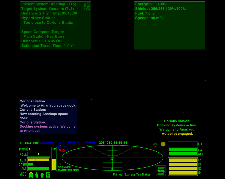
On the left side of the main scanner are the speed, pitch and roll, fuel, cabin temperature and altimeter gauges. The Compass and Scanner Zoom are also here, and Comms messages will be displayed above these gauges. Laser temperature, shields and Energy have been grouped together on the right side. The Console messages are also on the right side, above the gauges, and the scoop indicator, status light and joystick sensitivity indicator also appear here. The Aegis indicator is bottom-right, and primed equipment is displayed to the left of this. The Clock is centred at the top of the HUD, allowing room for up to the maximum of 16 pylons at the bottom.
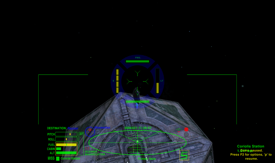
CombatHUD at Red Alert
The Combat HUD has been optimised for combat situations. If a scanner targeting enhancement is fitted the reticule will turn red when the target is centered. When at 'Red Alert' the right-side dials (weapons temperature, fore and aft shields and energy) are removed and replaced by dials arranged around the crosshairs, with the laser temperature to the right, energy to the left and fore and aft shields above and below the crosshairs. This allows close monitoring of these vital functions during combat, and the dials are slightly transparent to aid vision. These dials are removed and replaced by the standard position dials when no longer at Red Alert.
Widescreen version
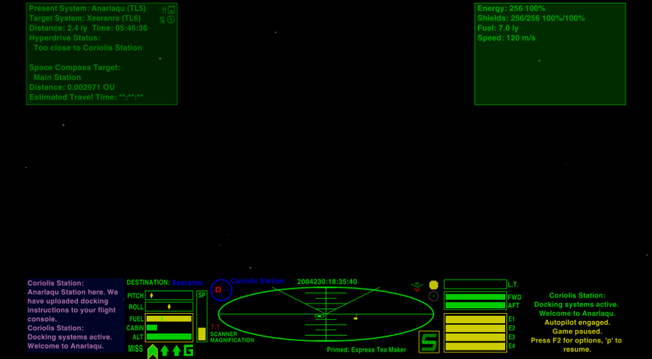
There is also a widescreen version for 16:9 and 16:10 monitors. This version moves the Comms and Console messages, and the MFDs to the top and bottom corners to keep the centre of the screen clear.
CombatHUD Widescreen
Licence/Author
This work is licensed under the Creative Commons Attribution-Noncommercial-Share Alike 3.0 Unported License. To view a copy of this license, visit http://creativecommons.org/licenses/by-nc-sa/3.0/ or send a letter to Creative Commons, 171 Second Street, Suite 300, San Francisco, California, 94105, USA.
OXP by Smivs
Installation
If your current player-ship comes with a built-in HUD this will need to be over-ridden. Using a text-editor (NOT Notepad!) open the shipdata.plist file (in the 'Config' folder) of your ship's OXP, where you will find a line like this:-
hud = "***hud.plist";
where the stars are probably the name of the OXP ship. Comment-out this line by placing two slashes and a space before it, thus :-
// hud = "***hud.plist";
When you start Oolite, hold down the 'shift' key untill you see the spinning Cobra, and your HUD will be installed and working.
Version History
v4.1 Released 6th July, 2014. graphical improvement to the Red Alert dials.
v4.0 Released 5th July, 2014. Major overhaul to add features. Widescreen version added.
v3.0 Released 29th June, 2014. OXZ only. Adds MFDs and 'Red Alert' functions to original design.
v2.1 Released 24th January, 2013. Corrects a code bug which caused problems in Oolite v1.77.
v2.0 Released 10th January, 2012. Fully updated and rationalised from 4 variations to one HUD.
v1.0 Released 4th January, 2012.
Download
Download CombatHUD_v2.1 OXP here
Download Combat HUD v4.1 OXZ (downloaded 3389 times).
Download Combat HUD-WS v4.1 OXZ (downloaded 3300 times).
Oolite Forum thread
Any questions, problems or bug reports should be posted on this OXP's BB thread here


